Hello fellow readers, it’s been a while since my last post. Hope all is well and that you’re enjoying the start of summer! Strey Dog recently reformulated their Old Fashioned mix and relaunched their product this past fall, so I wanted to share our creative journey with y’all. They reached out to Kramer Madison for a logo design refresh project that quickly evolved into not only a new logo design, but new bottle labels and an updated website too.
Pour yourself a cocktail, sit back and enjoy the story!
The skinny: Their marketing goals were to elevate brand awareness as well as securing more locations to sell the product. They were looking for an updated logo to be used on their new packaging. Challenge excepted!
The Old Fashioned is a classic American cocktail that draws its origins from the prohibition era of the 1920s. Bootleg whiskey was in abundance and there were plenty of places to find it thanks to organized crime, which is why it makes sense that cocktails like the Old Fashioned would take root in the Midwest with our strong German roots. Since that Era, the Old Fashioned has a been a staple drink found in any Wisconsin bar.
Founded by Wesley Strey and Scott Schoenmann, Strey Dog brings this drink back to its roots with a bold blend of citrus and spices in their hand-crafted bitters with a hint of cherry for that little bit extra. Whether you like a classic Wisconsin supper club drink or a traditional booze – forward cocktail that brings out the flavor of your favorite whiskey or brandy, Strey Dog Old Fashioned Mix can give you the drink you like, the way that you like it!
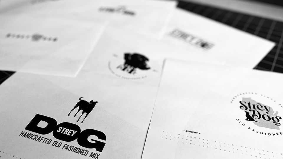
When I received word asking me to work on refreshing the Strey Dog logo design, I immediately got to work. The brief was to create a logo that was clean and simplistic with immediate brand recognition. Call me old fashioned, no pun intended, but I always prefer hashing out the problem via sketches vs. the computer. I proceeded with a dozen of conceptual sketches to see what iterations would stick before venturing to designing in the digital realm.
Old Fashioned. New Tricks.
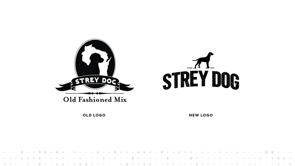
It was challenging to narrow the logos down to only a few, but once I had made some selections, it was time to bring them to life. Eventually, we landed up sending the client several new logo design directions for them to choose from. They landed on the final logo shown above, which is a sleeker, more contemporary take that still embodies the Old Fashioned and Wisconsin roots, but with a modern and fresh look. The bold curved text, with a splash of distressing, is the main focal point, while the refined dog icon now acts as a supporting graphic standing dominantly above the text and accompanied by the “Since 2017” tag for historic value. It’s true, you can teach an Old Fashioned new tricks. Sit, Strey Dog, sit. Good boy!
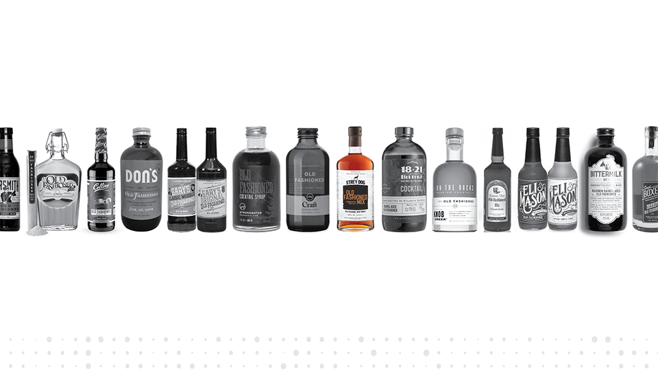
Great packaging can be the key difference between your product and your competitors’.
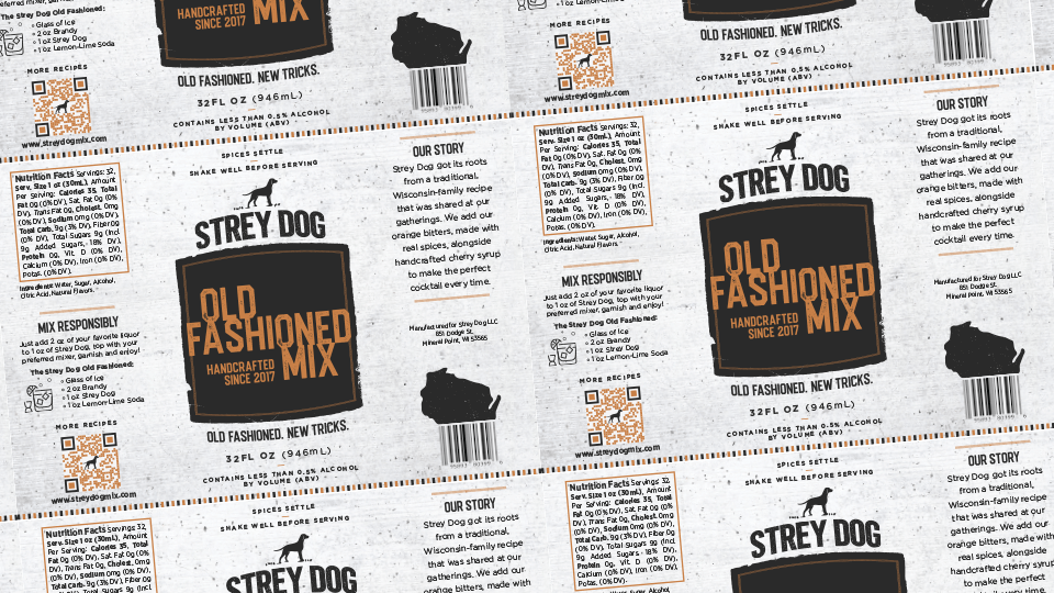
Next up: the label. After playing with the type treatment I wanted to use for the header and tagline on the label, I focused on going with a more rustic route for the background artwork to play off of the historic Wisconsin roots mentioned above. I aimed for simplicity but wanted the final design to stand out from the competitors in the market. Most of the typography you see on the label was handset for a bolder unique style to help establish the Strey Dog brand.
I also used customized playful icons for the recipes section, QR code and designed a Wisconsin silhouette graphic barcode (see the label banner image at the top). Since the bottle is clear to see the mix settle, I went with a simplistic white color palette with a hint of a textured background to help balance out the smokey black logo and supporting copy. The rustic orange swatch used for the main header is a sample of the Strey Dog mix itself.
The best part of the entire process was R&D — sampling the reformulated mix Strey Dog. I mixed myself a couple of Korbel Brandy Old Fashioned sweet cocktails with a splash of Strey Dog and Sprite. Trust me, the taste test was like Christmas time in your belly, every time. Good stuff!
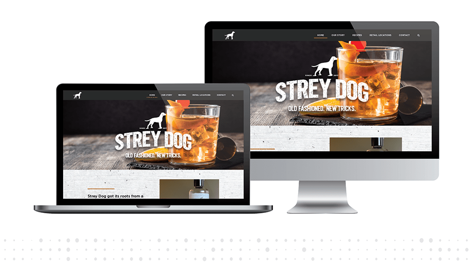
Many of the label graphic treatments were transferred over to the website design for an overall cohesive look. The candid photography helps support the overall brand. The number one goal was to create a user friendly experience for both mobile, tablet and desktop views. The updated website’s home page shows the drink as the hero as well as an embedded social feed to grow brand reach by showcasing posts from Strey Dog’s Facebook page. Highlights of the interior pages include “Our Story” featuring a link to both a Wisconsin State Journal feature, and WIFS-TV’s Talk of the Town interview. Mix up the taste of an endless Wisconsin summer with an easy classic from Strey Dog’s “Recipes” page, and lastly, search a radius ranging from 10 to 500 miles to find your soon-to-be-favorite handcrafted mix on the “Retails Location” page.
To my delight, the client loved the final results. Check it out yourself and take a gander at several delicious Old Fashioned recipes at streydogmix.com today.
If you have an upcoming logo (or packaging, or web) design project that needs tending to, don’t be shy… give us a call today at (608) 849-1984 or click here to get started. There isn’t a project and/or challenge that Kramer Madison can’t handle.
Until next time, Cheers!
